
Website accessibility checklist: the 8 fixes that matter first
Back
A website accessibility checklist is only useful if it leads to real fixes: visible focus states, clear headings, readable contrast, labeled forms, and media that still works when the audio is off or the layout changes. W3C organizes WCAG around four principles, and Google's people-first guidance reminds teams that useful content is written for people, not for ranking tricks.
For product and marketing teams, the best checklist is practical rather than ceremonial. It helps design, content, development, and QA ask the same questions in the same order before launch, and it keeps a relaunch or landing-page sprint from becoming a pile of isolated fixes.
The four principles behind every good audit
WCAG 2.2 is organized around four principles. That matters because accessibility stops looking like a giant checklist of random tasks and starts looking like a system. If you only audit alt text, you miss forms; if you only audit forms, you miss focus, contrast, and structure.
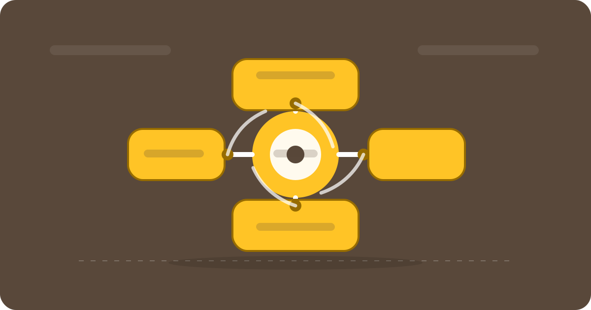
The four principles create one system for perception, operation, understanding and robustness.
The useful test is simple: can people perceive the page, operate it, understand it on first contact, and still rely on it when browsers, devices, or assistive technologies behave differently than expected?
1. Perceivable content
Perceivable content is the foundation. Images need meaningful alt text when they carry information; decorative graphics can stay empty. Color cannot be the only cue. If an error state is red, it still needs shape, text, or another signal that works without color. And if you publish video or audio, captions and transcripts should be part of the plan, not an afterthought.
Hierarchy matters too. Headings, spacing, and grouping should make the page easy to scan. The less a visitor has to decode the layout, the more likely they are to stay oriented and understand what the business offers.
2. Keyboard access
A site is only operable if every important action works with a keyboard. Menus, buttons, forms, dialogs, and overlays all need to be reachable, and the focus state has to stay visible. WCAG 2.2 adds specific focus guidance such as Focus Not Obscured and Focus Appearance because hidden focus is a common failure.
A quick team check goes a long way: Tab through the header, navigation, forms, and dialog flows. If you get trapped in a menu, lose the active element, or barely see where you are, the interaction is not ready yet.
3. Clear structure
A page is understandable when its structure is obvious. A real H1, logical subheadings, precise link text, and a consistent page language help users and search engines at the same time. Google's helpful-content guidance is a good reminder that useful content is not the same as keyword stuffing; it is content that actually helps a person move forward.
That does not make SEO irrelevant. It means semantics beats fake structure. If a section is an FAQ, it should read like one. If a link opens a contact form, the link text should say so. Clarity builds trust before the first sales conversation starts.
4. Forms that explain themselves
Forms are where many good websites fall apart. W3C's forms tutorial recommends visible labels, sensible grouping, clear instructions, understandable validation, and precise feedback. Placeholder-only forms usually make people work harder than they should.
In practice that means every field needs a real label, error messages should say what went wrong and how to fix it, and long forms should be broken into steps that make sense. If a security step uses time limits, users should be able to extend or remove them instead of being pushed out of the process.
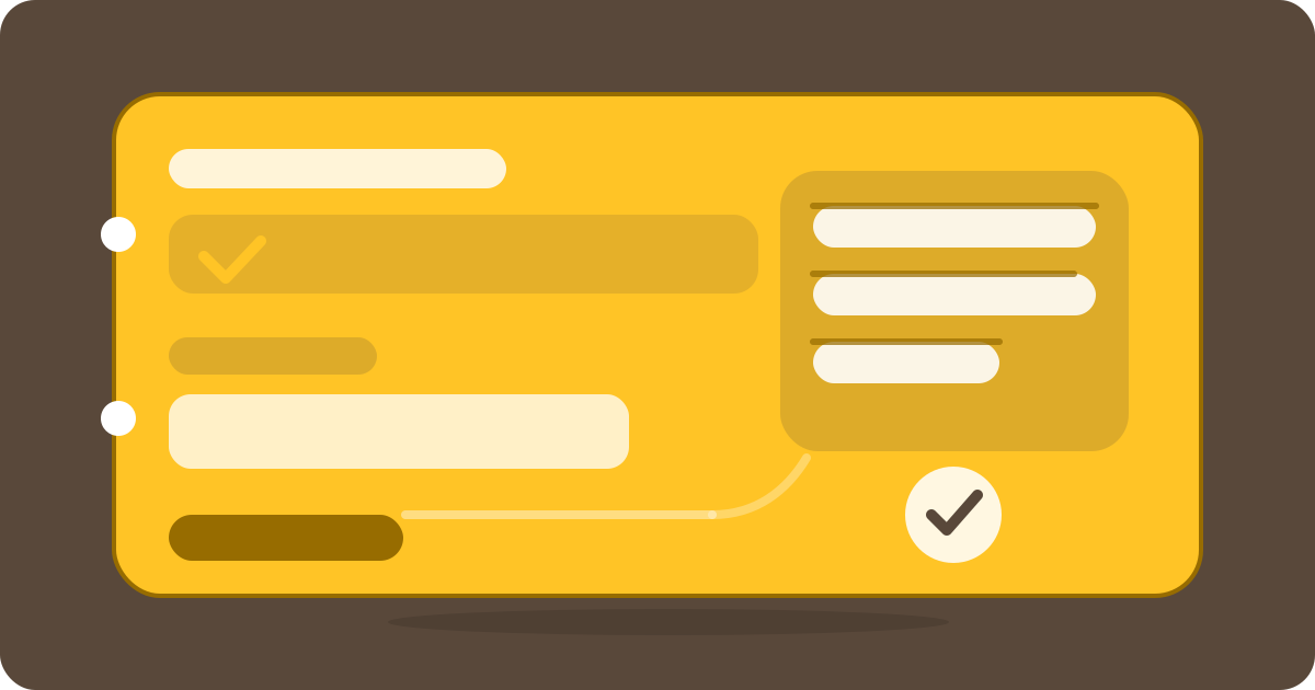
Clear labels, visible focus and precise feedback make forms easier to complete.
5. Media and motion
The same rule applies to media and text: information has to remain accessible. Video needs captions, audio needs transcripts, and autoplay is usually a mistake because it takes control away from the user. Motion should be deliberate and restrained; nothing should flash or demand attention without a reason.
Animation can still be useful. If movement is purely decorative, it should never block content. If it explains a change of state, a reduced-motion alternative should exist. That makes the experience calmer, not duller.
6. Contrast, zoom and target size
Contrast is not a taste issue. W3C's contrast guidance sets at least 4.5:1 for normal text and 3:1 for large text. That matters for people with low vision, but it also matters for anyone reading outside, on a small screen, or in poor lighting.
Pages also need to scale. Content should not break at 200 percent zoom, and buttons need enough size to be usable on touch devices and in dense layouts. If a design only works in a perfect screenshot, it is still a concept, not a robust system.
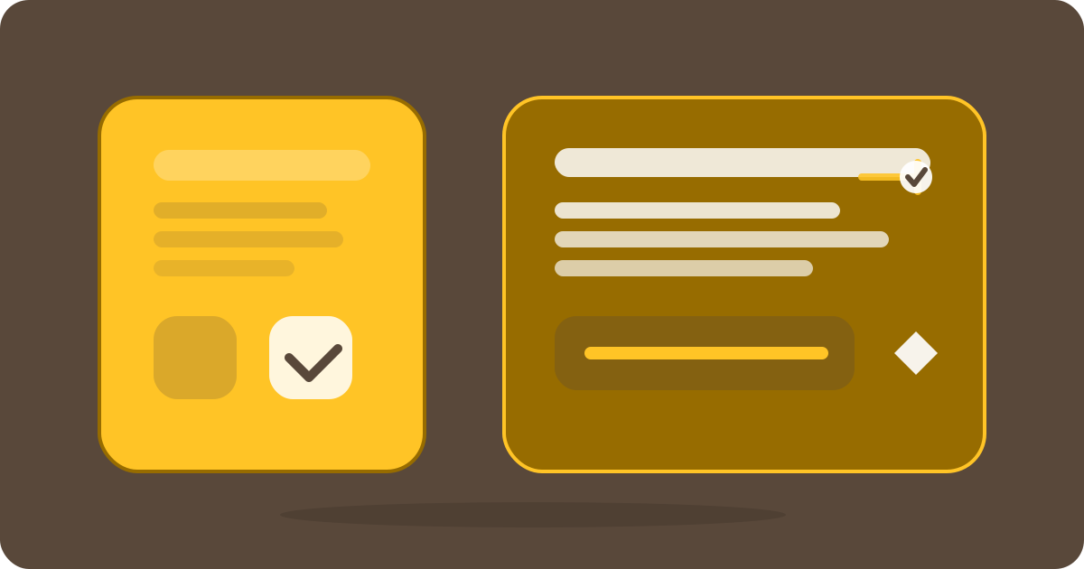
Contrast, zoom and focus should be tested together before launch.
7. SEO and content architecture
Accessibility does not magically improve rankings, but it does improve many of the things rankings and conversions depend on: clear structure, better readability, cleaner semantics, and less friction in forms and navigation. That is especially important on service pages, landing pages, and CMS-led editorial workflows.
The same question starts both disciplines: can a person use the page without guessing? If the answer is yes, both the user and the search engine usually benefit. If the answer is no, even perfect meta titles only do so much.
8. Test early, then repeat
A real checklist does not end with design. It needs a test plan: automated checks for contrast and markup issues, manual keyboard passes, and content reviews for headings, link text, and error copy. Automation catches many defects quickly, but never all of them.
The best starting point is usually the highest-risk pages: homepage, service pages, forms, checkout, login, and contact. If those are clean, the biggest wins are already in place. Everything else can follow in a calmer, more systematic way.
The next sensible step is a short review of the pages that matter most for conversion: check the content, test focus states, tighten form flows, and make the editorial logic easier to maintain. That is how a checklist becomes a process.
Sources and further reading
W3C WCAG overview: https://www.w3.org/WAI/standards-guidelines/wcag/ · Google helpful content: https://developers.google.com/search/docs/fundamentals/creating-helpful-content · W3C forms tutorial: https://www.w3.org/WAI/tutorials/forms/ · Contrast minimum: https://www.w3.org/WAI/WCAG21/Understanding/contrast-minimum.html
FAQ