
Design system documentation for websites: what matters first
Back
Design system documentation is not a nice-to-have archive for websites. It is the shared working base for design, content, and development. It defines which tokens, components, page sections, and states can be reused so marketing pages stay consistent, ship faster, and remain easier to maintain.
Why design system documentation makes websites faster
Figma describes design systems as building blocks and standards that keep products reliable. Zeroheight adds that good documentation should make vision, tokens, components, patterns, guidance, and process visible. That mix is exactly what many marketing websites are missing: the pieces exist, but they are not connected cleanly.
The result is familiar. Every new landing page becomes its own little exception. Colors, spacing, buttons, form states, and content modules get debated again even when the answer should already exist. Good documentation reduces that friction. It is not just documentation for designers; it is an operational tool for everyone who builds pages, maintains content, or approves releases.
What a design system documentation should include first
• Design tokens for color, typography, spacing, and radii. Without that base, everything else stays open to interpretation.
• The core components: header, hero, buttons, cards, form elements, and navigation. Document variants, states, and when a component should not be used.
• Content rules for headings, microcopy, CTA tone, and image use. A marketing website gets much more consistent when content is not only well written but also structurally bounded.
• Accessibility notes for focus states, contrast, keyboard use, and error states. The W3C resources on WCAG and the WAI tutorials help teams document the system in a way that is both visual and technical.
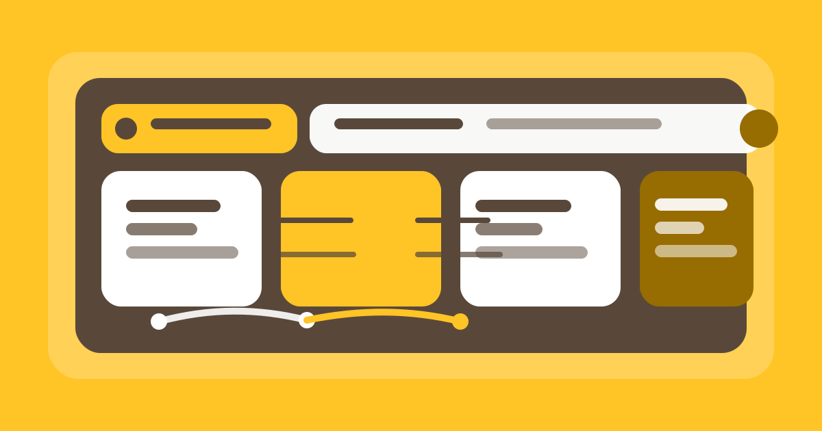
Foundations like tokens and typography set the base that components build on.
A style guide is not enough
A style guide usually shows how the brand should look. A design system also explains how the building blocks work together, how they are implemented in code, and who maintains them. That difference matters: a style guide can support inspired decisions, but a design system protects repeatable ones.
For sites with many editorial surfaces, you need both, but not in the same drawer. If everything lives in a PDF or scattered Figma pages, the documentation slowly becomes fuzzy. Figma itself distinguishes between visual guidance and systematic reuse; in practice, that means rules first, examples second.
Document components, content, and states clearly
The real work starts with the repeating patterns. For marketing websites, those are often hero sections, benefit cards, feature modules, trust blocks, FAQ sections, and forms. Each of those building blocks needs clear rules: what content fits, which variants exist, how it behaves on mobile, and what happens in error states?
If those questions stay open, every team member builds their own version. That is when inconsistency shows up: a button with too much text, a card with no image rule, a form with a different error pattern. Good documentation makes those decisions visible and comparable instead of renegotiating them in every sprint.
Document what is not allowed as well. Good docs are not just a gallery of pretty screens. They also say when a module should not be used, which contents may be truncated, and which states must always be tested. That saves correction work later in design, development, and editorial operations.
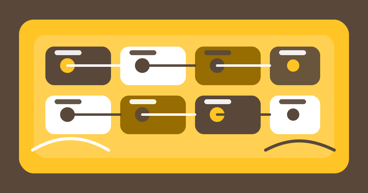
Components are easier to maintain when states and reuse are documented visibly.
Governance: who changes what, when, and why?
The best documentation fails without upkeep. Every system needs clear ownership: who can change tokens, who decides on new components, and who records code changes so design and content do not drift apart?
A simple workflow is often enough: propose, review, approve, publish, and maintain. The important part is keeping the process light enough to use. If upkeep becomes too cumbersome, changes drift back into private notes or Slack threads, and the single source of truth disappears.
That is where a central home pays off. Whether it is Figma, a documentation tool, or a headless CMS, the format is less important than making version, status, and ownership visible to everyone.
Why this also improves SEO and conversion
Search engines do not rank design systems directly, but users benefit from them in concrete ways. When a website is structured consistently, people understand pages faster, find CTAs more easily, and trust the content more readily. That affects dwell time, interaction, and ultimately conversion.
SEO also depends on editorial stability. Teams that document reusable building blocks create less sprawl, fewer duplicate patterns, and fewer pages that are live technically but messy editorially. Helpful, clear pages are often the pages that stay maintained long after launch. That follows the logic of Google’s helpful content guidance: content should help people, not just chase keywords.
Quick self-check before you start
• Can new team members find the core building blocks within a few minutes?
• Does every component have clear examples, states, and no-go cases?
• Are accessibility, content rules, and responsive behavior documented?
• Is it clear who approves changes and when the docs are updated?
• Could a new landing page be built without extra Slack back-and-forth?
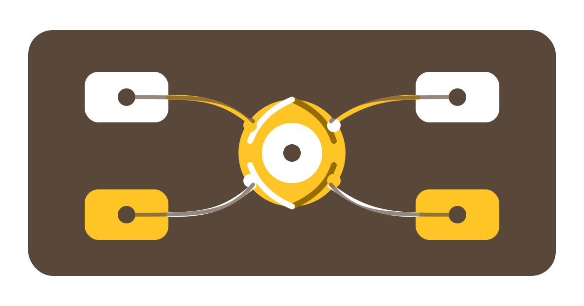
A clear approval and upkeep process keeps the documentation current.
FAQ